Charles Ostman

Gallery
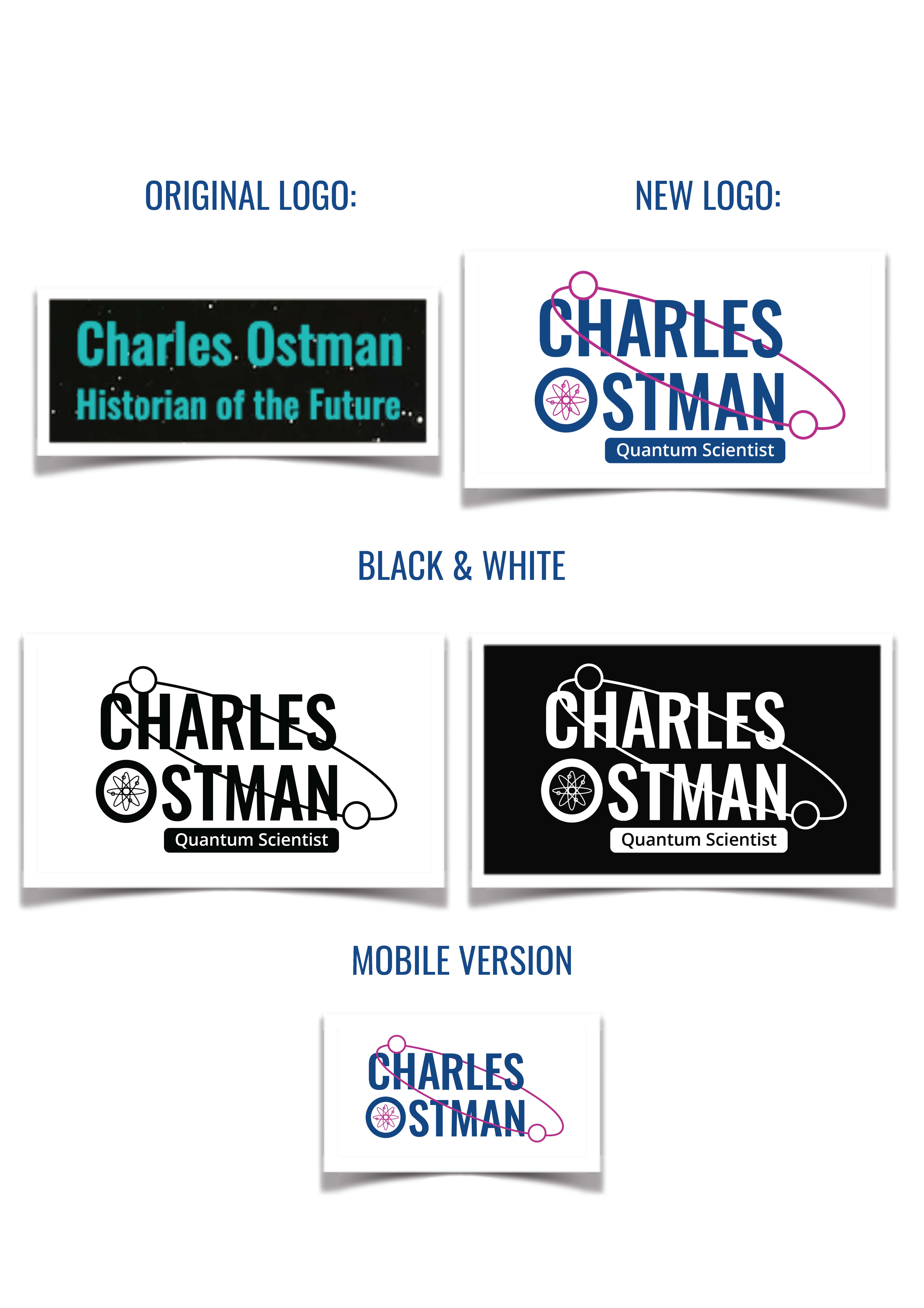
For this reason, I tried to make the rebranding close to the original by choosing a quite similar font for the logo, and add some details that represent the field of services of the brand.
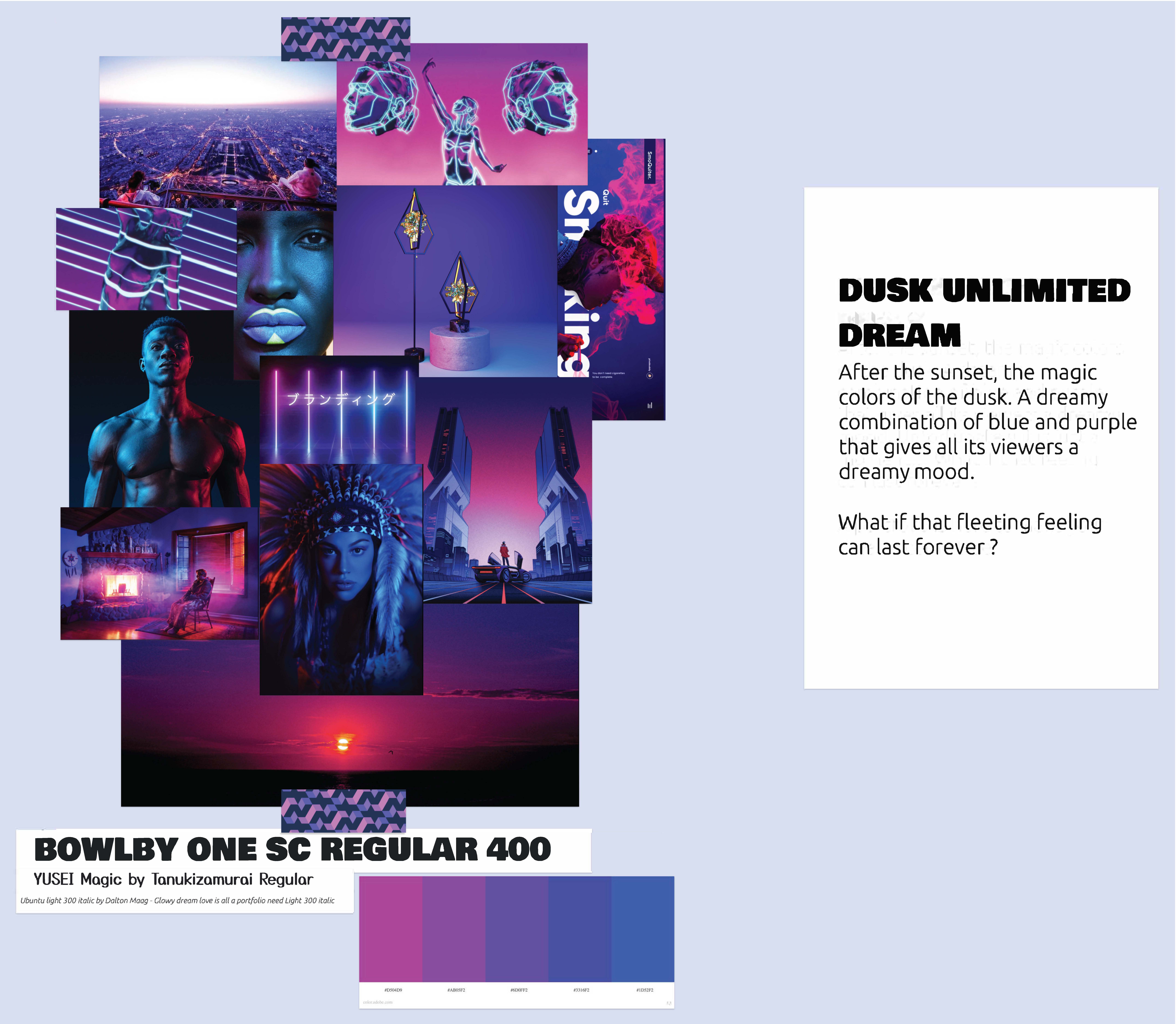
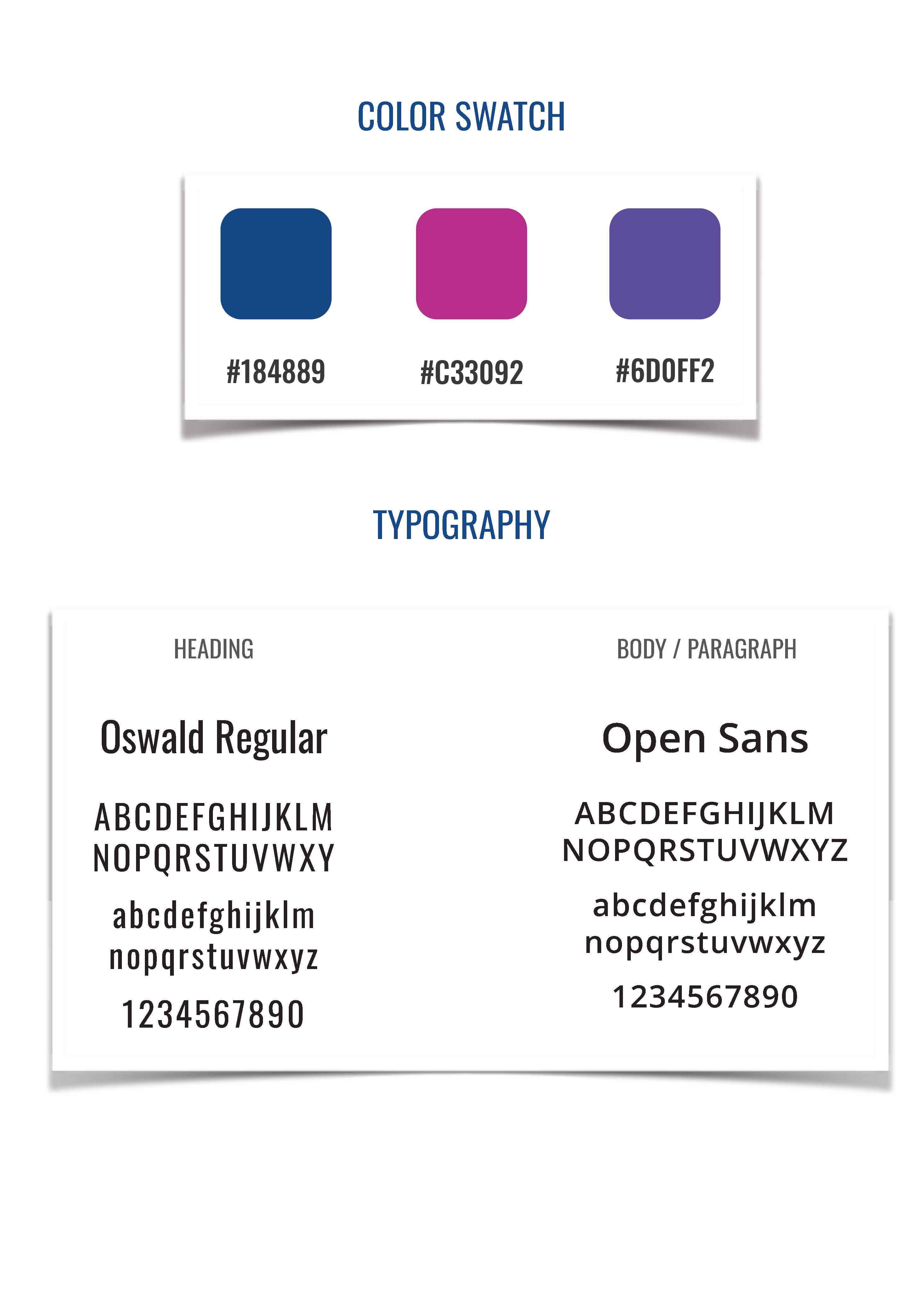
For the color, I had chose the colors relating to the quantum science and the space atmosphere. Also, to use those close in a consistent way allover the new design.
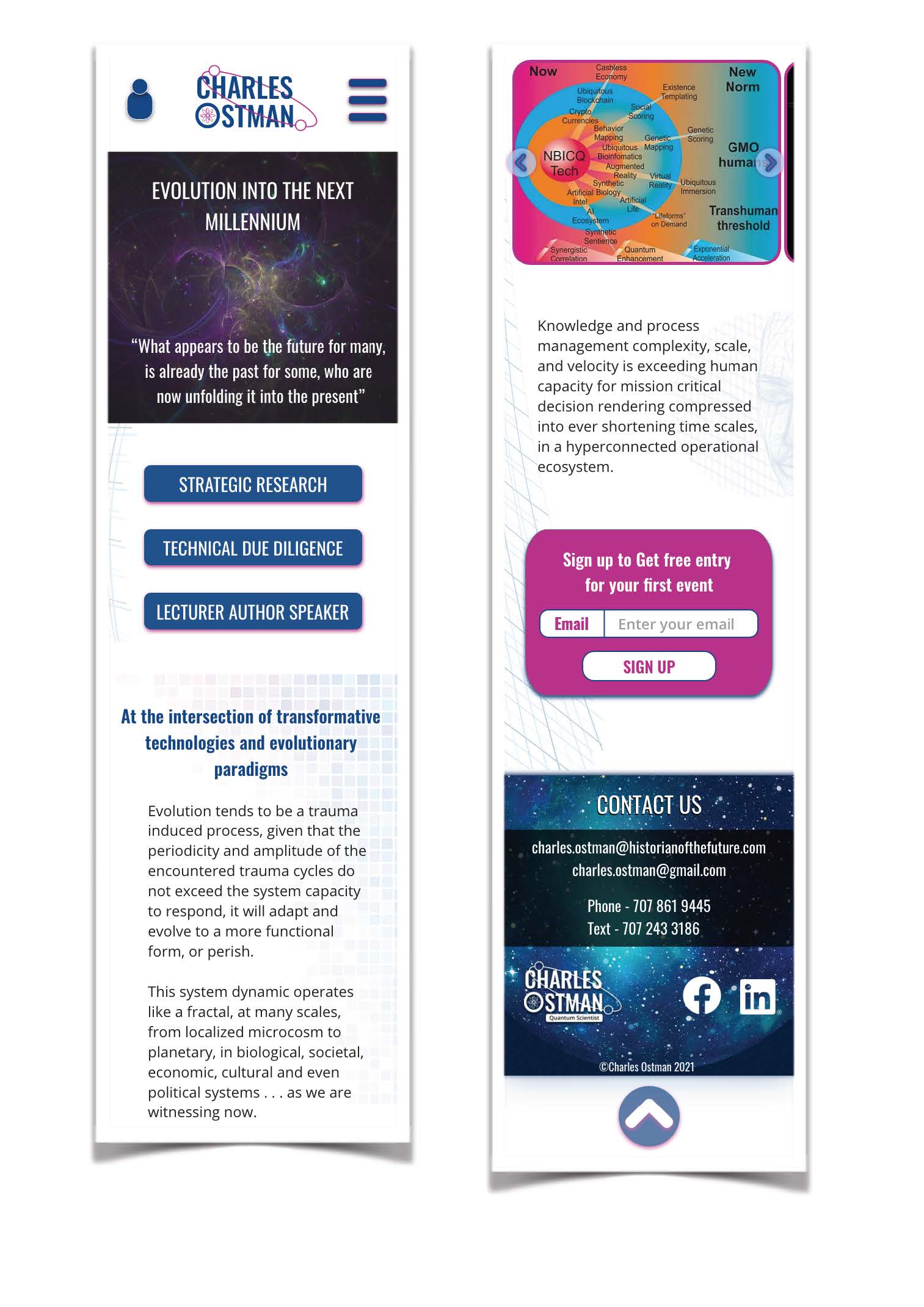
For the layout and the content organization, I used grouping item, and more white space to organize information. Also I tried to fit to use background images of the same atmosphere to relate to original design, and only for the first section and for the footer. 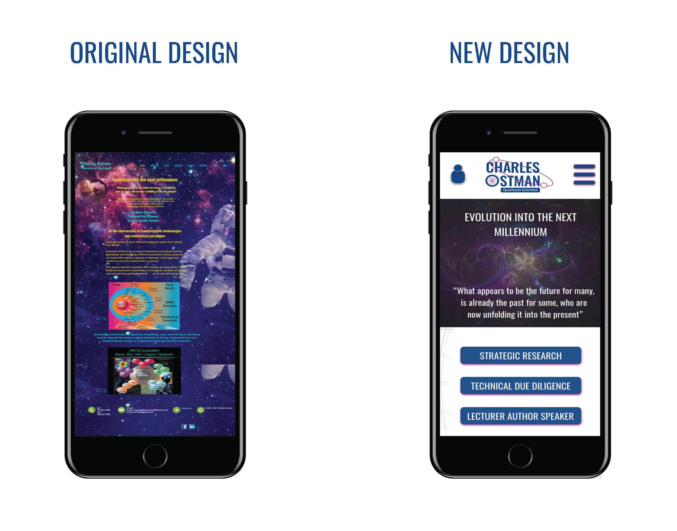
Also, a soft use of shapes and illustration in the background of the of the body content, to subtly guide the reading and to separate sections.
I used a reciprocity technique for a call for action, because there was no call for action to encourage the user to interact with the services of the brand.
Interactive prototype
Previous project
Rhezala Haute CoutureNext project
SportAll